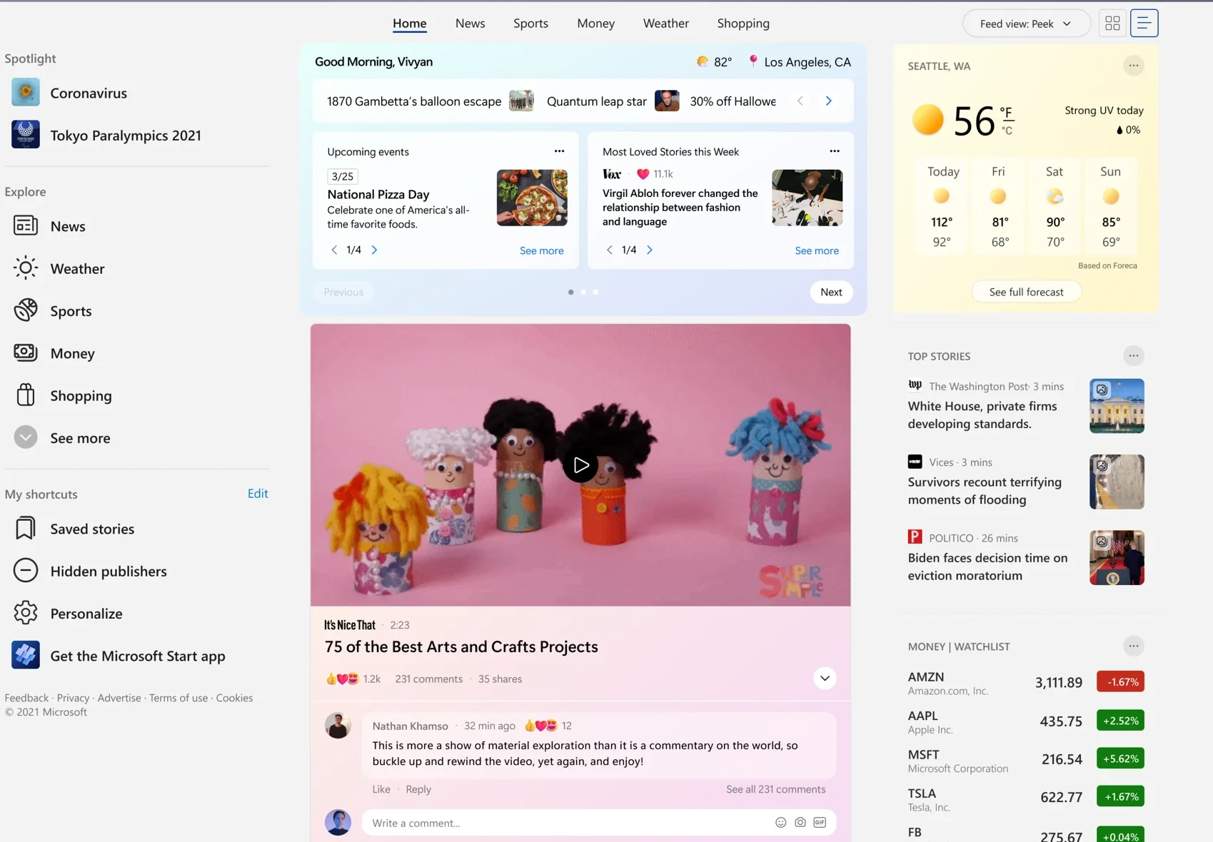
Microsoft Single Column Feed
My Roles & Responsibilities
My responsibilities included user research, product strategy, aligning stakeholders on product goals, designing user flows, interaction design, prototyping, user testing, quality assurance, and creating design guidelines.
Context
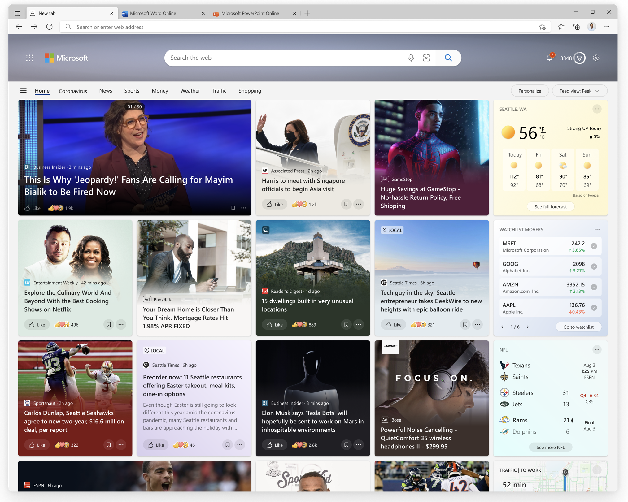
Microsoft Start is a news aggregator website and mobile app that features news headlines and articles that MSN editors have chosen. The app includes sections for top stories, regional events, international events, politics, money, technology, entertainment, opinion, sports, and crime, along with other miscellaneous stories
The problem
Only 50% of DAU/Visitors engage with the current grid experience. User research proved that most users jump off to social heavy experiences like Facebook, LinkedIn, Twitter and Reddit.
Ad and content experience optimized for Top heavy page
No user interaction past first row/InfoPane
Too many moving stories, lack of predictability and focus
Relevance and personalization is a challenge
Personalizing across 4 or 5 columns of content
Reliance on editorial programming
Why aren’t users engaging with the feed?
Only when scanning objects in a list layout, research has shown that the following are true:
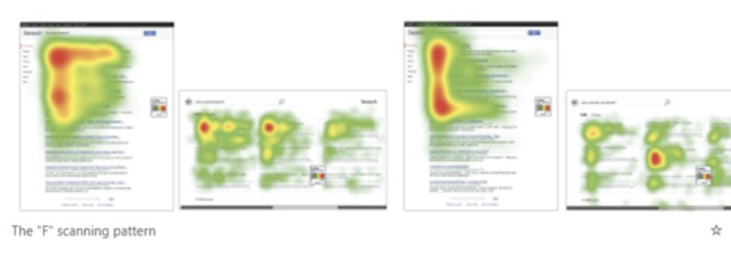
Users scan objects in the "F" layout
Lists are optimized for fast scanning and location of an object
Works best for information that has a defined order (e.g. alphabetized, ranked, numbered, by date, etc.)
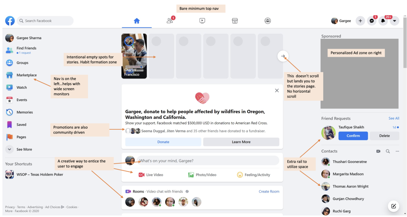
Common themes around right rail span between topics interests to follow and personalized display ads
Hypothesis
A modern feed optimized for focused content consumption and promoting community actions, will engage better with our users and help attract new user segments building daily habits.
Engage
Higher Scroll rates through the feed
Higher video consumption via inline player
Higher CTR on Content and Ads due to better relevance and recommendations
New user segments
Higher Scroll rates through the feed
Higher video consumption via inline player
Higher CTR on Content and Ads due to better relevance and recommendations
Wireframing & Content Architecture Exploration
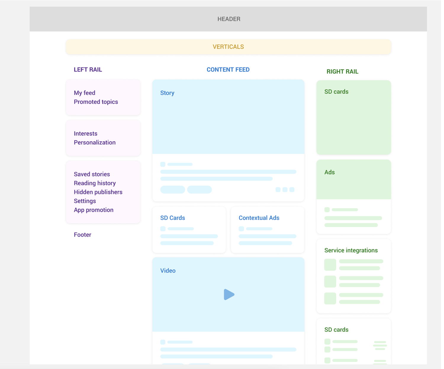
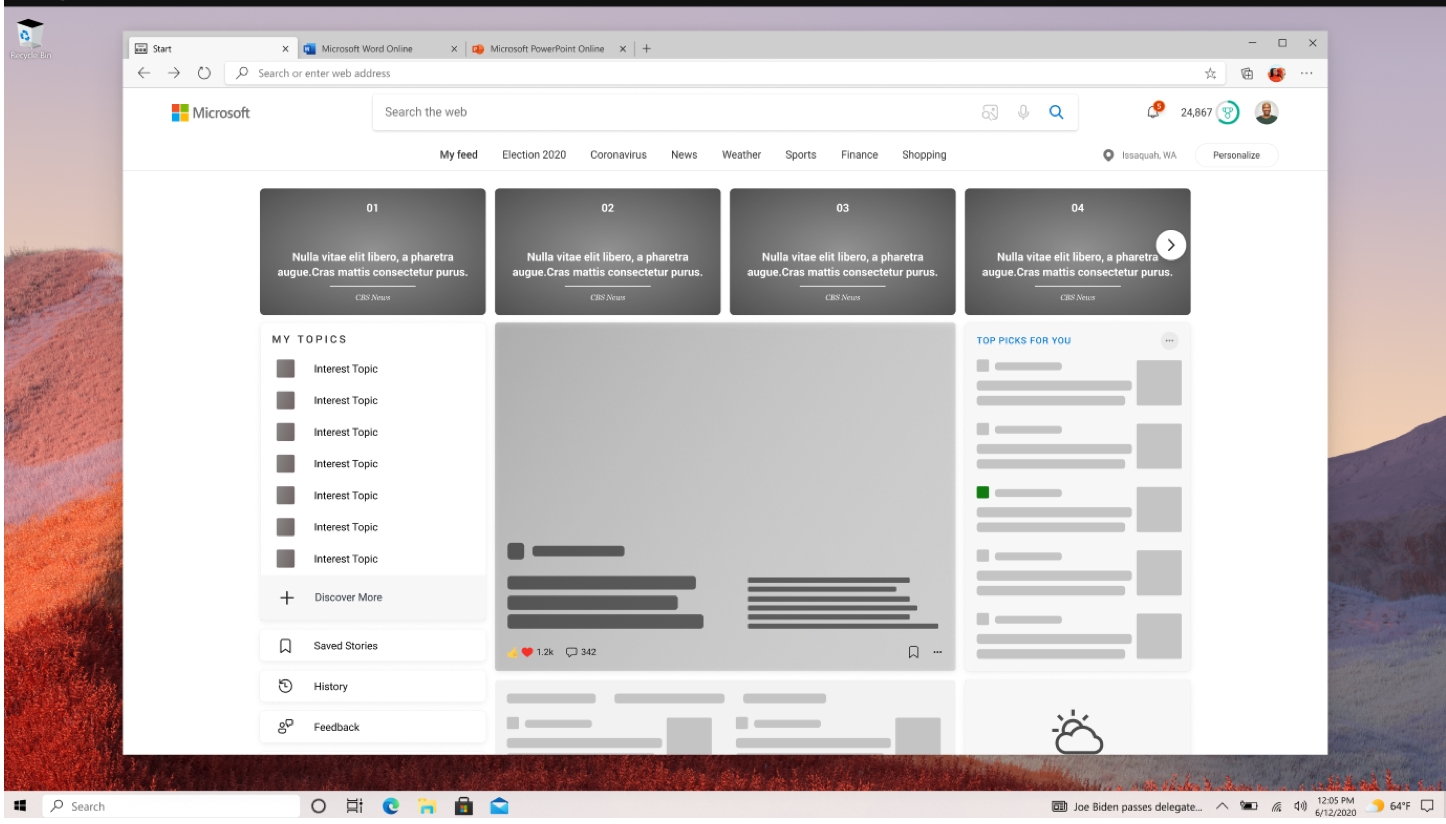
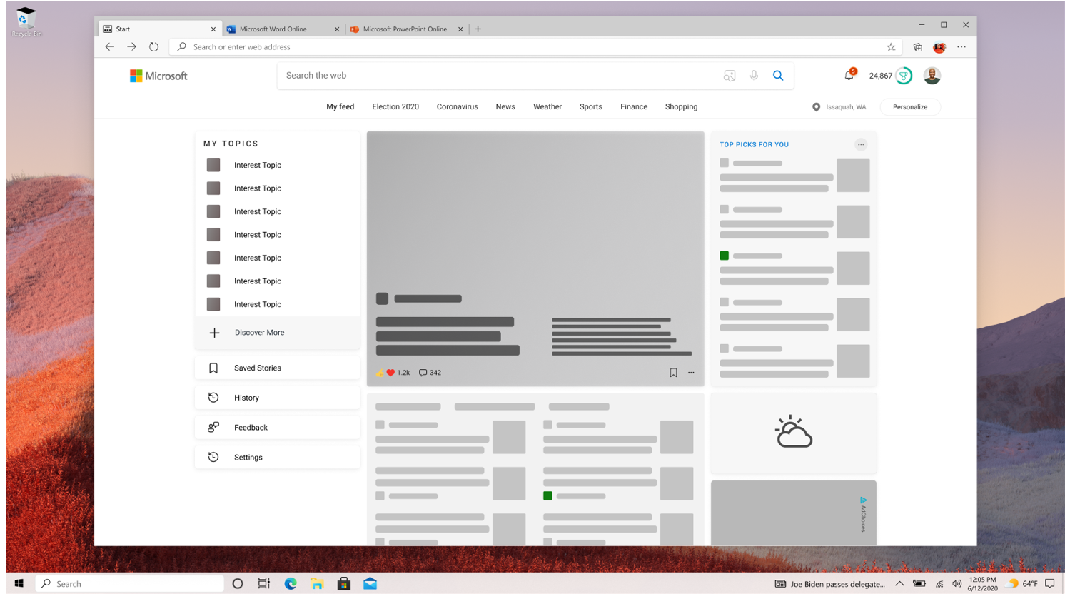
Explored different content frameworks through a series of low- to mid-fidelity wireframes, experimenting with hierarchy, density, and module sequencing. Worked closely with product partners to evaluate how each variation impacted scrolling patterns, card engagement, and the readability of the overall feed.
Validating the Direction Through A/B Testing
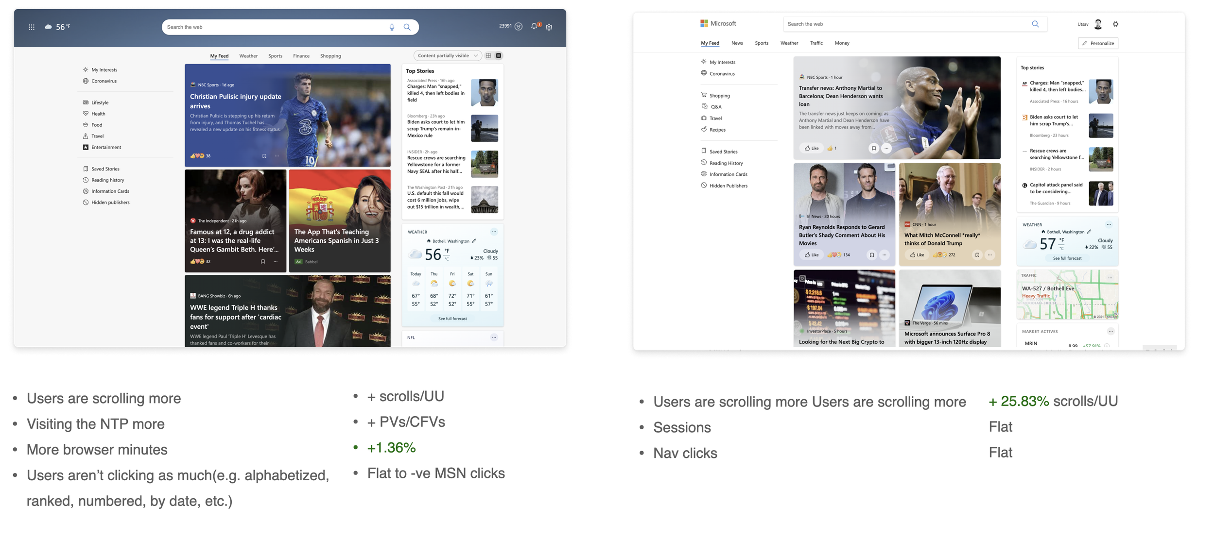
Launched an MLP to A/B test our early concepts directly in-market. Delivering a minimal but realistic version of the experience allowed us to gather behavioral data, validate our direction, and determine which patterns should shape the long-term North Star vision.
Continue to build towards a North Star
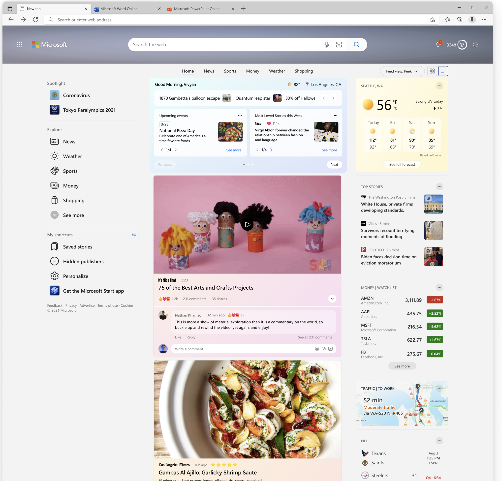
Shifting to a single-column feed brought us closer to the North Star vision for a cleaner, more human-centered Microsoft Edge news experience. By reducing density and modernizing the layout, we saw the experience instantly resonate with users:
Scrolls/UU up 25.83%
Browser minutes up 1.36%
CI DAU up 0.66%
This direction also strengthened engagement across Pivots (+11%), InfoPane (+2.66%), and ad cards (+8%, +5% revenue), reinforcing that we’re building toward the right long-term ecosystem.
