Amazon Luxury Stores Website Redesign
Role: Lead UX Designer
Platforms: Web & Mobile Web
Team: Design, Product, Engineering, Brand Studio, Research
Overview
I led the UX redesign of the end-to-end Luxury Stores ecosystem across desktop and mobile. This included rethinking brand pages, homepage modules, navigation, and storytelling components to create an elevated and cohesive shopping experience. My focus was on bringing structure, clarity, and modern editorial behaviors into a system that could scale across hundreds of luxury brands.
Through iterative exploration, testing, and close collaboration with product, engineering, and creative stakeholders, I delivered a more intuitive and visually refined experience one that balanced high fashion’s storytelling needs with Amazon’s performance and discoverability requirements.
Problem
Luxury customers struggled to discover new designers and navigate editorial content. Pages lacked hierarchy, felt crowded, and didn't reflect premium fashion standards. The existing branding also felt dated—its color palette and visual language didn’t match the expectations of modern luxury shoppers. Without a modular system for brand launches, every page felt inconsistent and required significant manual effort to build.
This became a clear opportunity to elevate the experience, modernize the visual identity, and introduce a flexible design system that could scale with future CX and brand needs.
Empathize / Research
Understanding the luxury customer — and what Amazon was missing.
I began by researching how luxury customers discover, evaluate, and purchase premium products. I reviewed existing metrics, read internal research, and conducted competitive audits of leaders like SSENSE, Net-a-Porter, and Farfetch.
What I found was clear: luxury shoppers expect curation, storytelling, and emotional connections. But the existing LS experience felt transactional and utilitarian. The visual language lacked cohesion, the content felt flat, and there was no personalization layer to make the experience feel tailored.
This early learning set the foundation for every design decision that followed.
Wireframes
To began the redesign with rapid ideation and low-fidelity wireframes to explore page structures that balance editorial storytelling with clear, shoppable paths. Focusing on layout, hierarchy, and simplicity, I created mobile and desktop wireframes for key pages brand landing, homepage modules, navigation, and shoppable lookbooks while defining consistent spacing, grid rules, and CTA patterns. These wireframes were tested with stakeholders and users to validate scannability, discoverability, and clarity before moving into the high-fidelity visual direction.
Brainstorming session
Brainstorming the future of Luxury Stores — together.
To unlock new thinking, I led a cross-functional brainstorming workshop with stakeholders across Brand, Outbound, Dawn, and Engineering.
We explored prompts such as:
“If Luxury Stores launched today, what would it look like?”
“What does an elevated shopping moment feel like?”
“How might AI create more curated luxury experiences?”
The workshop generated dozens of ideas — from editorial landing pages, to cinematic image ratios, to taste-driven feeds powered by upcoming Pose/Aura integrations.
Out of this session, I distilled four design tenets that anchored the redesign:
Elevated, Curated, Personal, Effortless.
These principles shaped every decision moving forward — from the typography and spacing to the tone of brand storytelling.
Final Designs
Turning ideas into something real and testable.
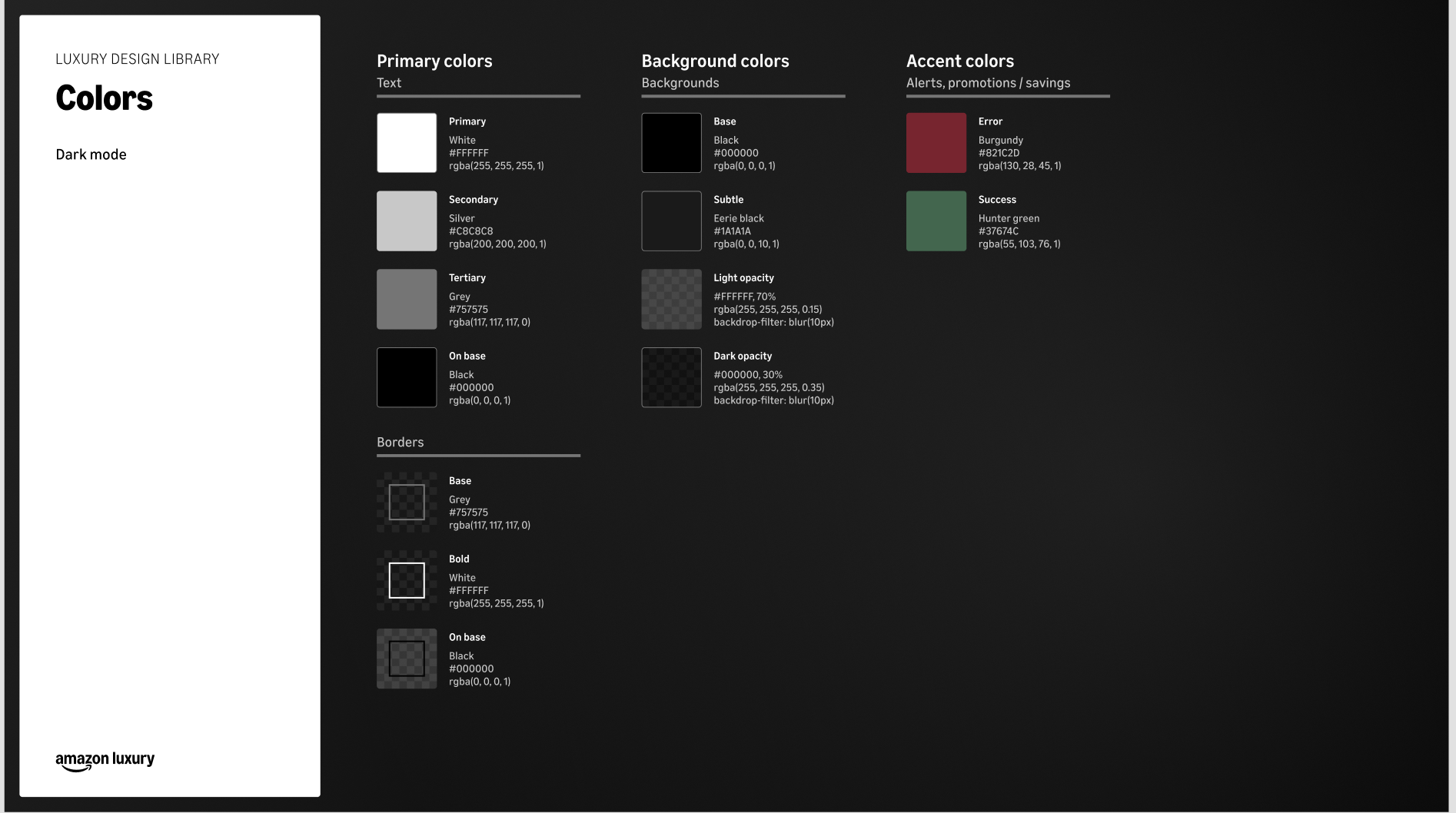
With the vision defined, I partnered with the Amazon Brand team to create a new color palette for Luxury Stores—one that felt modern, elevated, and cohesive across surfaces. This palette became the foundation for our redesigned homepage, brand storefronts, seasonal drops, and upcoming AI-driven features like Pose/Aura.
I then built high-fidelity prototypes to show how the new visual system worked end-to-end. These prototypes aligned leadership, informed engineering decisions, and helped build cross-team momentum. The result set a new standard for premium shopping on Amazon and strengthened brand trust across the experience.
Documentation & Hand off to Developers
I built a tokenized spacing and grid system to ensure consistency across storefronts, campaigns, and seasonal drops. I refined image ratios so they felt cinematic and modern. I created templates that allowed brands to show up with clarity and confidence, whether they were heritage maisons or emerging designers.
At the same time, I collaborated with engineering to balance all of this against Amazon’s performance requirements — ensuring the experience looked premium without sacrificing speed.
Success metrics since launch
+18% increase in scroll depth
+12% increase in PDP click-through
Adopted across 20+ brand pages
Stronger brand perception internally and externally
What I Learned
Designing for ambiguity requires a hypothesis-led approach
Luxury Stores had competing priorities: brand partners, personalization, AI entry points, editorial content, and commercial needs. Creating a clear set of hypotheses helped the team focus on the “why” behind decisions, not just the “what,” and made it easier to test, iterate, and socialize direction.


